|
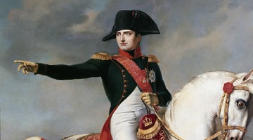
Sometimes even the most terrible disasters have serendipitous consequences. Napoleon's disastrous invasion of Russia in 1812 for instance have been said to be a worthwhile "investment" just because of a single chart that was drawn 57 years after. This chart have been said to be a triumph that even the great French general (who was an amateur mathematician himself) would approve of.
As they say, when life gives you lemons... |
"From the sublime to the ridiculous is but a step."
Napoleon Bonaparte, speaking about troubles in his invasion of Russia (10 December 1812)
Charles Joseph Minard is most widely known for a single work, his poignant flow-map depiction of the fate of Napoleon’s Grand Army in the disasterous 1812 Russian campaign. This Carte figurative des pertes successives en hommes de l’Armee Franc¸ais dans la campagne de Russe 1812-1813 has been called “the best graphic ever produced”, one which seemed to “defy the pen of the historian by its brutal eloquence”.
|
More generally, Minard was a true pioneer in thematic cartography and in statistical graphics, and developed many novel graphics forms to depict data, always with the goal to let the data speak to the eyes. The definitive biography of Minard and his contributions to thematic cartography by Robinson begins, “When the complete story of the development of thematic cartography is finally added to the history of cartography, the name of Charles Joseph Minard (1781–1870) will again take on some of the lustre it had during the later part of his lifetime. The fifty-one cartes figuratives that came from his fertile mind and adept hand show a combination of cartographic ingenuity and concern with the graphic portrayal of statistical data that was almost unique during the central portion of the century”.
Minard was the son of an official of the constabulary and comptroller of the local college in Dijon. At age 15 he was accepted in science and mathematics at the reknown Ecole Polytechnique in Paris (1796–1800); among his professors Fourier and Legendre made a strong impression. In 1800, he transferred to the Ecole Nationale des Ponts et Chausees (ENPC), the premier training school for engineers responsible for building ports, roads, canals, and later railroads in France. He remained with the ENPC for his entire professional career (1803–1851), first as a field engineer, later as an instructor on “interior navigation” and railroad construction. In 1830, Minard was appointed a superintendent, then divisional inspector (1839), and finally Inspector General of the ENPC (1846) at age 65. Even after manditory retirement on his 70th birthday in 1851, Minard continued his role on the advisory board of the ENPC journal, Annales des ponts et chausees. More importantly, his development of new graphic forms and themes nearly doubled in rate for 10 years, and continued up to his death at age 90. |
|
Minard’s first career was as a practical engineer; but even here he showed a flair for novel visual explanation and portrayal. His report on the collapse of a bridge on the Rhone includes a superposed before-after drawing that shows directly to the eyes that the bridge collapsed because the supports collapsed on the inflow side of the river.
Minard’s second career, as a visual engineer and developer of new forms of statistical graphics and thematic cartography begins in 1844, with his first tableaux graphiques. These attempt to show the differential costs for transport of goods and people, for the entire route of a line vs. the parcours partial of rates for intermediate travel. To show this in a “graphic table,” Minard invented a new form of of the divided bar chart, where the widths of bars were scaled to distance along the route, and the heights of sub-divisions of the bars were scaled to proportions of passengers or kinds of goods. Consequently, the area of each rectangle would be strictly proportional to the cost or price of transport, in pounds or people-kilometers. These graphic tables were important early progenitors of modern mosaic displays.
Quite shortly, Minard realized that geographically-based quantitative information could better be shown on a map, as bands of width strictly proportional to those quantities, so that again, area = length x width would convey total numbers or amounts. From a first crude flow-map of passenger travel from Dijon to Mulhouse, Minard would proceed to develop this graphic representation of flow-overspace into a near art form, always allowing the precise portrayal of statistical data precedence over the confines of the His graphic catalog contains numerous instances. Perhaps the most dramatic are a pair of flow-maps showing the trade in cotton in Europe in 1856, and again in 1862, after the outbreak of the American Civil War. Just a glance makes clear that blockade on exports of raw cotton from the US South stimulated this trade with India.
Throughout his later years, and especially after his retirement, Minard continued to study new topics and to invent new graphic forms. He was the first to use pie charts on a map, where he extended William Playfair’s use of them to show both the relative proportions (of meats sold in Paris: beef, veal, or mutton) by angular slices, and the total amount of meats by the area of each pie. In 1865, the city of Paris needed to build a new central post office. Minard’s solution was a map showing the population of each arrondisement by squares with area proportional to population, so that the ideal location was their visual and geometric center of gravity.
Minard’s influence and contribution to visually-based planning was such that, from about 1850–1860, all Ministers of Public Works in France had their portraits painted with one of Minard’s creations in the background. At the 1857 Vienna meeting of the International Statistical Congress, the methode a la carte graphique du chemin de fer francaise (an apparent reference to Minard) was recognized favorably in the debate on standardization and classification of graphical methods. In 1861, some of Minard’s works were presented to Napoleon III (a singular honor for an engineer of middle-class background), who received them with enthusiasm.
Minard’s most famous work, his depiction of Napoleon’s Russian campaign, deserves special mention in this brief biography, in part because it is the only known graphic portrayal of a national defeat, in France, or elsewhere. Chevallier makes the reasons clear: As a young engineer in Anvers in 1813, he witnessed the horors of war in the seige by the Prussian army. In his final year, he sensed the renewal of the Franco-Prussian war and, though frail and infirm, fled to Bordeaux with his family.

Among his last works, he drew a pair of flow-maps together: the famous one of Napoleon’s Russian campaign, and another of Hannibal’s retreat from Spain through the Alps to Italy, again with great loss of life. “The graphical representation is gripping; it inspires bitter reflections on the human cost of the thirst for military glory”. It may well be, for this reason, that Minard’s most famous graphic defied the pen of the historian.
Ponder this
Statistics is about presenting data into meaningful, concise information. Is there a limit to this? How much is too much?
What sets Minard apart from Florence Nightingale (who was known for her charts during the Crimean War)?
Discuss
In his famous infographic, Minard provides at least five datasets (army size, location, direction, temperature, time) in a single chart. if he were to have access to our modern tools, how many more datasets can be included?
Further readings
Charles Joseph Minard, from Wikipedia
Charles Minard’s Flow Map of Napoleon’s Russian Campaign of 1812, from DataViz History, includes an English translation of the famous chart.
Background on Minard's graph including original sources, by Edward Tufte
The Graphic Works of Charles Joseph Minard, by Michael Friendly, Department of Psychology, York University